The fashion industry is built on gambling. Demand planners have to place orders on rapidly evolving trends months in advance. By talking to CEOs of mid-sized fashion brands, we realized brands need to automate the planning process to be adaptive in real time, or die trying.
I joined a stealth-mode pre-seed start-up for 4-months to transform complex data layers into intuitive insights for its 40+ year old users, working with the engineers and users to refine AI dashboard prototypes and MVPs.
Team
Me (Contractual Design Lead)
Christopher Hugentobler (Founder)
Jimmy Chu (Engineer)
Problem
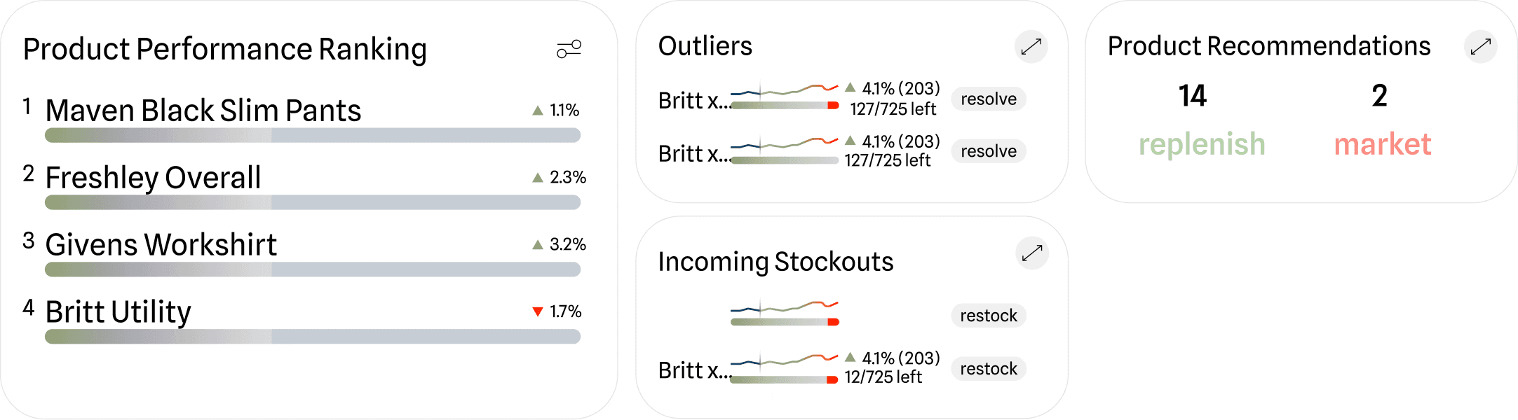
The UI and explanations honored the mission to make demand-planning lightweight

The new dashboard metrics transformed insights from passive to actionable and verifiable. This saved clients weeks of manual excel work to identify and act on supply chain shocks.

Size-level drop-down eliminates unnecessary information at dashboard level but makes product health at granular size level accessible when needed

Intuitive and humanist explanations upon hover helps the user transition to the new product during onboarding period.

Low actionability
Users had to navigate cluttered ui to determine and act on risky products, slowing execution due to manual due diligence.
Low verifiability
Users couldn’t verify AI prediction sources, and so are less likely to adopt insights, making the product less effective.
Risk became our north star
f(risk) = abnormal*movement
By creating a user journey, the founder and I isolated the key pain to be manual monitoring risks across the season

From a data perspective, we had narrowed down what data to manage and display in a logic map
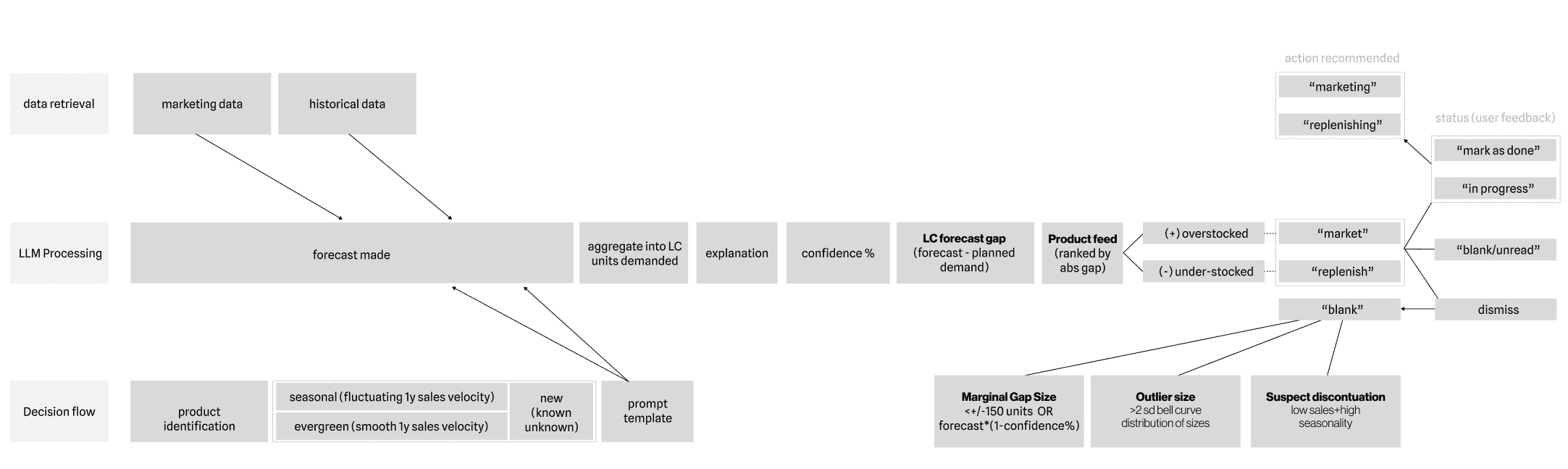
Process
Working questions for refining data-viz
How to best distill complex size, time and inventory-level data at first glance?
which information is most essential to display first?
How do we streamline onboarding to prevent low user adoption?
Self-imposed Constraints
Keeping data unbiased by eliminating convoluted, unclearly structured data, or dark patterns early
Standardized taxonomy - This builds trust and buy-in from demand planners by embedding familiar concepts
Scalable mvp that is buildable across rows and columns
At a glance insights to reduce mental load
Allow for direct feedback for the design and forecast accuracy
Breaking task down

Pivotal Crossroad: Grid Versus Rows
We had to accurately forecast, identify and assign actions for products tied to risk levels.
Independent widgets and charts caused unnecessary engineering and user context-switching.
A fully integrated dashboard enabled scalable columnar data, row-by-row product comparison, and a seamless user flow.
So we abandoned the widget concept, but it informed the final time-series chart design
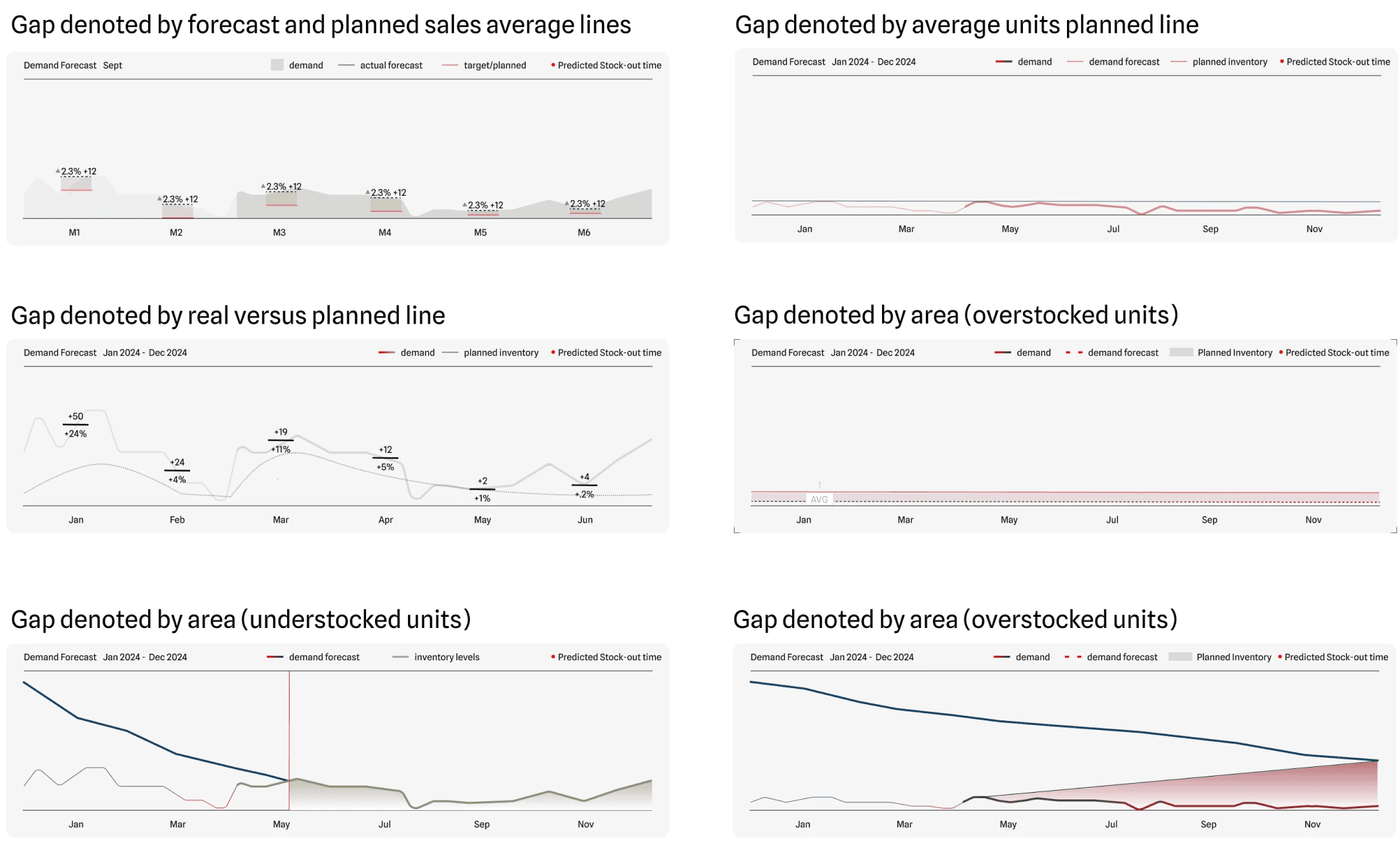
Visualizing data over time
To show abnormality over time, I experimented with various time series charts, this informed the product feed.
By asking the customers to explain the chart to us and how they reached their conclusion, we were able to narrow down which types of visualizations directions were most intuitive to scan regularly.
Development
Halfway through development, the team collectively decided to launch the final design as a responsive google sheets MVP. I adapted the Figma design accordingly using spark-lines.
This enabled the client to onboard directly onto our product, play with our data, and integrate it their google-sheet sheet-heavy work-flow without investing front-end development costs up-front.
I worked closely with the engineer to make this google sheet a home for him to programmatically updated live data onto

Result
After shipping the redesign, we were able to increase engagement amongst existing customers and engage clients worth over 1M ARR
50% of existing customers found this intuitively easy to use without an onboarding
50% of existing customers included this in their weekly SIOP meetings
Reduce time to act (from weeks to days) by 40% through actionable CTAs
Cut support and onboarding queries by 25% (simplified, granular workflow)
Qualified 2 trial customers to consider premium subscription worth 1M ARR for demand planning needs
Soft signs of traction
Users readily adopted alongside existing system
Users pulled up the sheet during board meetings
Learning
This contractual project was a rare chance to collaborate closely with product, engineering and users to ship live changes via weekly sprints.
“Yes. This is well-designed. I don’t even know how you did this.” Christopher Hugentobler (Founder) on seeing the Google sheet dashboard
No such thing as too many variations
I committed to ideating a new component or data concept daily
Through rigorous comparison and analysis with the founder, we identified optimal solutions and articulated why certain hierarchies or components outperform others to prevent over-engineering.
This iterative approach also helped me detach from early ideas, ensuring design excellence
Mindful Design
Tools that allow for manual monitoring is the worst waste of human attention and intelligence
Something designed once ends up used a thousand times over. We should be mindful of how a product is used and the deeper implications for users.
When exploring forecast charts, my main motivation was Josh (user), a 40+ year old demand planning veteran. Our dashboard saved him hours every week staring at excel sheets by making data easier to monitor and act on.
AI ethics
Disclosures and estimated accuracy encourage further investigation and prevent overlying on AI-generated insights to inform multi-million dollar purchase decisions.
I enjoyed refining accuracy metrics with the users to reach the more verifiable dashboard we have today.